Decorating


Style in Ikea Catalogue 2013

Just received the new Ikea 2013 catalogue in the post and thought I would share some of the cool style pictures in there.

Bright colours and blonde wood combined with graphic expressions in textiles. That’s the core of the Scandinavian graphic style. 

Blonde Scandinavian style – The furniture is functional in form and design. The textiles are patterned with organic prints, and balanced with geometric forms.

Grey-brown stain with an addition of brushed natural pine, faded colours on metal, linen and raw fibres. That’s the quick recipe for creating a style that’s rustic and easy living.

Inspired by the Swedish countryside…By mixing check and stripes, and hand-crafted accents this style has a relaxed and welcoming feel.

Black and white is always a good foundation to build on when creating your personal style at home. 

Bring in nature – rattan, bamboo, untreated pine, organic patterns and green accent colour.

Colour can bring new life to any room.

Seafoam and Lime Green Kitchen

Amazing modern kitchen with seafoam green cabinets and lamp and lime green chairs. Love the color scheme, the contrast of the neon brightness against the neutral palette.

seafoam green kitchen

Pastel Colonial Home

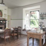
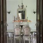
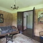
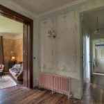
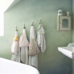
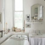
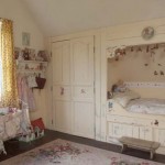
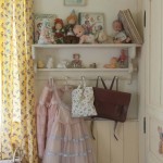
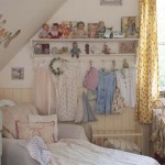
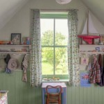
Gorgeous colonial style home with a true vintage vibe in nostaglic pastels situated in Kent, England.

via

Gloria Vanderbilt Amazing Home

The amazing home of Gloria Vanderbilt featured in NYmag.

The painting above the fireplace titled: Objects on Blue and Yellow was made in 1953 by Gloria Vanderbilt.
fireplace

Entrance painted in bold colors.
walls in red

portrait red walls

Eclectic mix.
boho chic

yellow office

The living room includes a painting by Thomas Adrian Fransioli of Gertrude Vanderbilt Whitney’s mansion in Old Westbury.
living-room-eclectic

Gray and Purple Bedrooms

Purple, the color of magic, mystery, royalty, spirituality and good judgement.

Purple is the combination of both blue and red, the blue creates and expansive and calming energy while the red creates an active, focused and dynamic energy.

Purple brings a new dynamic to the activity of red and the expansion of blue. Red brings practicality to the undirected expansiveness of the blue, and allows more creative energy to emerge, which is why purple is associated with inspiration and imagination.

Gray is a truly neutral color, one that invokes a deep sense of rest. Mixing gray with a more vibrant color like purple, mutes its vibration creating a stabilizing effect.

So in bedroom design, the combination of purple and gray gives you a calming, soothing, restful space that is also focused, creative and full of magic!

Images via pinterest and houzz